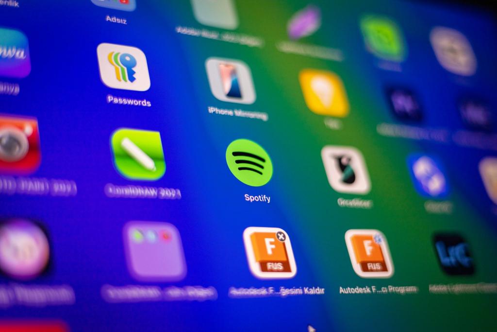
Somewhere on TikTok, a teenager is redesigning her phone's home screen to look like Windows Vista. The icons are glossy, almost wet looking, with water droplets and green grass behind them. The comments call it gorgeous. If you told an app designer in 2016 that the future of interface design would look like a 2009 weather widget, they would have laughed. And yet: the gloss is back, and Apple put it on a billion phones.
The design is called Liquid Glass, and the Liquid Glass Frutiger Aero parallel is hard to miss. Apple unveiled it at its Worldwide Developers Conference on June 9, 2025, calling it the new visual language for iOS 26, iPadOS 26, macOS Tahoe 26, and the rest of its platforms, according to reporting from MacRumors. It shipped to the public on September 15, 2025. Buttons, menus, and tab bars became translucent layers that bend and reflect light in real time, responding to whatever is behind them on screen.
Tab bars shrink as you scroll and grow back when you scroll up. The system shipped publicly on September 15, 2025, Livemint reported, across iPhones, iPads, Macs, and Watches at once. The lock screen clock stretches behind the subject of your wallpaper. It is, as Gizmodo put it in its WWDC coverage, the first major iPhone interface overhaul since iOS 7 in 2013, the update that flattened everything and ended the era of fake leather calendars and stitched notebooks.
That is the twist worth sitting with. The generation now in its late teens and twenties grew up staring at the glossy screens Apple killed. They were children when Windows 7 booted up with its translucent window borders, when iPhone app icons still had reflections baked into them, when websites wore aqua bubbles and brushed metal like jewelry. Then flat design arrived in the early 2010s and scrubbed the shine off everything. Interfaces became grids of colored rectangles and thin type. The gloss survived mostly as a joke, a fossil, something designers used to demonstrate how far the industry had come.
What Frutiger Aero actually is
Frutiger Aero is the name for that glossy period, and its story says a lot about how aesthetics get named. The term was coined in 2018 by Sofi Xian of the Consumer Aesthetics Research Institute, whose naming gave the Liquid Glass Frutiger Aero conversation its vocabulary, according to Wikipedia, years after the style's peak. At the time it had no name at all. It was simply how technology looked from roughly the mid-2000s to the early 2010s: skeuomorphic details that imitated real materials, glossy and transparent surfaces like glass and water, bright colors, and nature imagery pressed up against the tech. Windows Aero, the design language in Windows Vista from 2006, was one of its first mature expressions. The Wii, early iPhones, and the marketing of nearly every tech company of the era wore it too.
The revival started at the end of 2022. TikTok creators began posting home screen redesigns, app icons, and desktop wallpapers in the style, often tagged with #frutigeraero or #thefuturethatneverhappened. The Aesthetics Wiki reports the main hashtag has been used more than 30 million times. Part of it was simple nostalgia, the familiar 20-year cycle at work. But part of it was a reaction. A decade of flat design had produced interfaces that were legible and efficient and, many users felt, had been scrubbed of any personality. The corporate flat illustrations that flooded tech marketing in the late 2010s made everything look like a wellness startup. Gloss felt human by comparison, or at least alive.
Apple shipped the revival before most people noticed
Liquid Glass is not literally Frutiger Aero. The 2026 version is not a straight reprint of fake woodgrain, and Apple's take is restrained next to the maximalism of the original era. Still, the Liquid Glass Frutiger Aero connection is the part that keeps getting written about, because both trade on the same visual vocabulary: depth, shine, and light that behaves like it has a source. But the design press noticed the rhyme immediately. Web Designer Depot called Liquid Glass a full-circle moment, describing it as skeuomorphism in disguise: the materials are new, molten acrylic instead of felt, but the philosophy is the same, simulating something tactile so the interface feels more real. Gizmodo's review of the WWDC announcement described iOS 26 as merging the best of flat design's uncluttered minimalism with just a smidge of skeuomorphism, glass and the way it reacts to lighting at different angles.
The reaction, fittingly, has been as divided as the reaction to the original gloss. Some users describe the real-time refraction as wizardry. Others call it a gimmick that washes out text and drains battery on older phones, with common complaints about readability on light wallpapers and cluttered interfaces, as detailed in coverage of the rollout. Apple added accessibility toggles like Reduce Transparency and Increase Contrast to address the legibility complaints. Whether or not the shine is usable in every context, the direction is now unmistakable: after thirteen years of flat, the industry's biggest design trendsetting company has decided depth and texture are worth bringing back.
The deeper story behind the Liquid Glass Frutiger Aero moment is what the gloss represents. Frutiger Aero's whole pitch was techno-optimism, the belief that technology and nature could coexist in a bright, harmonious future. That optimism curdled sometime in the 2010s, replaced by the anxious minimalism of the platform era. Gen Z reaching back for water droplets and aurora wallpapers is reaching back for a version of the future that stayed out of reach, and finding it comforting. Design writers have a newer name for the broader shift, "tactile maximalism," buttons that look like jelly or chrome, backgrounds with grain, interfaces that seem to have weight, which one 2026 design essay described as a psychological response to AI-generated sterility, a hunger for human materiality.
What happened next is the part few people planned. A TikTok aesthetic that started as internet nostalgia became the reference point, and then Apple, the company that ended the glossy era in 2013, rebuilt its entire interface around a translucent, refractive version of it. The aesthetic Gen Z resurrected as a joke about a future that stayed fictional is now the default look of the phones in their pockets. As a coda to a year of shine, the site has tracked parallel 2026 visual shifts too, from maximalist joyful dressing to the boho grunge revival, each one pushing back against a decade of flat. The future arrived late, and it is shiny.
Comments 0
No comments yet. Be the first to share your thoughts!
Leave a comment
Share your thoughts. Your email will not be published.