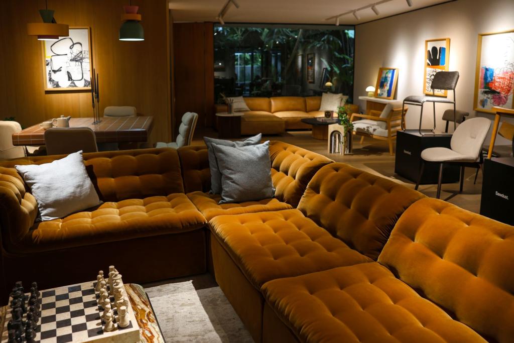
Sage green had a good run. For years it colored every "calm home" Pinterest board, every staged rental, every houseplant-filled corner. Now the designers calling the shots this fall say it's on its way out, and the replacement is chocolate brown.
Interior designers are ditching sage green for a cocooning chocolate brown in 2026, a Paris Select Book report published September 18 describes shades that run from chestnut to hazelnut. According to the report, the rich color wraps a room without overwhelming it, calling to mind raw wood, worn leather and falling leaves. It fits the wave of earthy tones that has been building in furniture and textiles for several seasons.
The consensus runs wider than one outlet. Houzz interviewed nearly 50 home design professionals for its 2026 U.S. Fall Design Trends Report, and one finding came through clearly: stark white and gray interiors are done. Warm color palettes, which first emerged as a trend in late 2023, have, according to the report, "transcended trendiness" to become what it calls the new baseline. Homeowners are layering warm wood tones, earthy colors, multiple textures, and natural materials throughout their rooms, giving them what the report describes as "more depth and personality" than the monotone interiors of the past few years.
Chocolate brown sits at the top of that pile. In a Parade roundup of seven fall home decor trends designers expect to see everywhere in 2026, brown earned its own slot. "Chocolate brown is back, and I'm genuinely glad," designer Goranson told Parade. "We spent a good decade drowning in white kitchens and greige-on-greige, and it got sterile. Now brown's showing up in paint, throw pillows, rugs, accent walls, actual color again." Goranson also told Parade the shade is a "forgiving" one when it comes to stains and wear, which doesn't hurt.
From accent to neutral
The bigger shift is how brown is being used. Architectural designer Elliot Marsh, writing in a September 2026 breakdown of what is actually changing in interior design this quarter, argues that moss green and chocolate brown are becoming the new neutrals. "Chocolate brown isn't a risky sofa color; it's the default," he writes. A brown wall is no longer a bold statement. It's the backdrop.
That is a full reversal from the all-white and greige era, when neutral meant some variation of white, oatmeal, or gray. Brown used to read as dated, tied to 1970s paneling and heavy leather furniture. The 2026 version has learned from those mistakes: the synthetic carpets and neon orange plastic accessories of that era are out, while the rich, comforting, nature-inspired color palette is back, paired with light teak, rattan, and natural stone so the dense shades never overwhelm a space.
There is a seasonal logic to it, too. Paris Select Book's reporting frames brown as a color that carries across multiple seasons without dating a space, which matters to renters and first-time homeowners who can't repaint every fall. In a Scandinavian-style living room with pale walls, the report notes, chocolate brown adds depth behind the sofa. In older apartments with original molding or parquet floors, it brings out character that has been hiding under coats of landlord white.
How to use it without shrinking the room
The designers quoted across this fall's trend reports agree on one point: a full renovation isn't required. The Houzz report's throughline is personalization over perfection, rooms that look "thoughtfully assembled over time," according to the report, rather than staged. A soft throw, a textured cushion, an amber lamp, or a secondhand wood piece can shift a room's mood, especially combined with warm lighting.
For renters, the low-commitment entry points are textiles. Velvet accent cushions or corduroy throws in cocoa and caramel tones layered over an existing beige or gray sofa deliver most of the effect for a fraction of the cost. Cane-backed dining chairs, bamboo room dividers, and rattan light shades keep darker tones from feeling heavy, which helps in small apartments where a dark wall can make a room feel smaller than it is.
For a bigger commitment, the reports suggest starting with a single accent wall in a muted brown or warm ochre rather than painting a whole room. Deep shades pull light in, and in north-facing rooms with cool light, that reads as cozy. In south-facing rooms with warm light, the same shade can skew richer, so it's worth testing a swatch over a few days before buying a gallon.
Marsh puts a finger on why the wave is happening at all, writing that moss and chocolate "make a room feel occupied even when it's empty, which is a strange thing to want from a color palette," and noting that it's exactly what his clients have been describing without having the words for it. Brown is the color of the season, but the actual trend is rooms that feel like someone lives in them.
Sources: reporting by Paris Select Book, fall decor trends from Parade, and the 2026 U.S. Fall Design Trends Report as covered by CultureMap Dallas.
Comments 0
No comments yet. Be the first to share your thoughts!
Leave a comment
Share your thoughts. Your email will not be published.